
ACCESS @ Cerritos - Supportive Styling

We’ve taken a week to catch up on our Easy Structure tips, and now it’s time to move on to our next ACCESS principle: Supportive Styling!
The way we style our Canvas pages and instructional materials can make a big difference in the classroom. Thoughtful choices in color, contrast, fonts, and formatting can make content easier to read and create a more welcoming learning experience for our students.
This week, we will focus on simple ways to use styling to support student learning while keeping accessibility in mind.
Need to catch up or revisit a previous tip? We’ve added all our tips to our ACCESS @ Cerritos webpage.
Readable Fonts
Start by choosing clear, readable fonts, or keep it simple by using the software’s default font.
Tips for using readable fonts:
- Choose simple fonts: Use clean, easy-to-read fonts such as Arial or Calibri.
- Use a readable font size: Aim for at least 12 pt in documents.
- Avoid decorative fonts: Scripts, cursive, or overly stylized fonts can make letters difficult to recognize.
- Limit font variety: Stick to one or two fonts throughout your materials. Consistency is key!
- Use bold sparingly: Use bold to emphasize important information.
Color Contrast
Good color contrast helps students distinguish text from its background, making content easier to read. WCAG recommends a contrast ratio of at least 4.5:1 for regular text (12 pt) and 3:1 for large text (12+ pt).
A quick way to check your colors is the Squint Test! Squint your eyes while looking at your text. Can you still distinguish the text from the background?
Time to Practice the Squint Test!
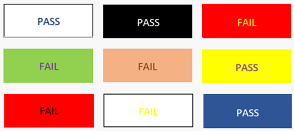
If the text blends in or becomes difficult to read, your color contrast may need improvement. Dark text on light background, such as black on white, is often a safe choice. Avoid combinations like yellow text on a white background, which can be difficult to read.
Also, avoid relying on color alone to communicate important information. Use headings instead!
Remember: The Squint Test is a quick visual check, but it does not replace the Color Contrast Checker to verify that your colors meet accessibility guidelines.
Spacing & Accessible Formatting
Spacing gives your content room to breathe!
Proper spacing helps students read and navigate instructional materials without feeling overwhelmed by large blocks of text. Use spacing between paragraphs, headings, lists, and other elements to separate ideas and make content easier to scan.
Also, avoid adding extra spaces by repeatedly pressing the Enter key or spacebar. Typewriters are gone! Instead, use the built-in paragraph and spacing tools in your software to create organized layouts.
Tips for Spacing & Accessible Formatting:
- Set Page Margins: Keep content at least 0.5 inches from the edges of the page.
- Align Text: Use left-aligned text for easier reading.
- Use Consistent Formatting: Keep fonts, font sizes, and spacing consistent throughout your materials.
- Avoid Overcrowding: Give text and other content enough space to prevent cluttering.
- Use Readable Font Sizes: Avoid shrinking text to fit more information on a page.
Remember: Good spacing and accessible formatting aren’t just about appearance. They help students find information, follow ideas, and navigate your materials more easily.
The 10-Second Test
 Take 10 seconds to look at your Canvas page or document. Is the text easy to read?
Does it stand out clearly against the background? Is there enough spacing or too much
spacing, and does the formatting look clean and consistent?
If you’re not questioning or second-guessing yourself, you’re on the right track!
Your Canvas Fix:
- Open your Canvas page and select Edit.
- Visually Check your Fonts. Look for text smaller than 12 pt and increase the font size.
- Review Spacing and Formatting. Add appropriate spacing between paragraphs, remove extra spaces and line breaks, and use Canvas’s built-in formatting tools whenever possible.

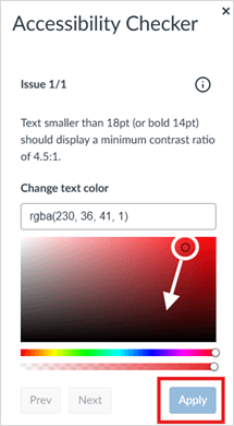
- Check Color Contrast. If you changed the font colors, open the Accessibility Checker in Canvas. Fix any identified issues by dragging your cursor over the suggested correction until the Apply button turns blue, then select Apply.
- Save your changes.
Why it matters: Supportive Styling makes instructional materials easier to read, understand, and navigate. By using readable fonts, sufficient color contrast, proper spacing, and accessible formatting, we can reduce barriers and create a better learning experience for all students.
Questions?
Need help making your Canvas content more accessible? Please feel free to reach out to the CTX Office or DE Coordinators.
We are happy to help!